
50% increase in feature adoption and 40% reduced user error through iterative testing for Developmate
Product and UI redesign following UXR for Developmate, a platform helping real estate developers consolidate due diligence data from 40-50+ websites into a single map interface.
Improved feature discoverability (estimated 50-60% increase), reduced onboarding confusion through clear differentiation (estimated 35-45% error reduction), and guided walkthroughs to accelerate time-to-value.
B2B Saas UX
Progressive Disclosure
Usability Testing
Onboarding
Map UI
Feature Discovery
Real Estate Technology
User Research
Prototyping
Design Systems
Interaction Design
Information Architecture
Developmate, a $100K ARR startup, needed to fix usability issues blocking feature adoption and trial conversion
Developmate helps real estate developers consolidate due diligence data from 40-50+ websites into a single map interface. At the time of design, they had secured funding and had paying customers. They wanted to improve adoption and address user experience across their early platform.
Despite having a functional product, usability testing revealed critical shortcomings: users couldn't find the legend (primary navigation tool), onboarding created confusion, and map interactions lacked visual feedback. For a rapidly growing SaaS platform, these friction points directly impacted trial-to-paid conversion and feature adoption.
The core issues:
Legend feature not discoverable, limiting users' ability to interpret map data
Onboarding confusion between "Create Account" vs. "Log In" causing estimated 40% error rate
Map interactions lacked visual feedback, creating user uncertainty
UI jargon caused misunderstandings and unexpected behavior
Trial users took too long to reach "aha moment," impacting conversion


I led usability testing with users and redesigned core flows using progressive disclosure to reduce complexity.
As team lead for 5 UX designers, I developed a 5-week testing and redesign plan focusing on: legend discoverability, onboarding friction, and map interaction patterns. We recruited real estate professionals matching the target demographic and conducted remote unmoderated testing sessions. The testing focused on four critical workflows: account creation, login, dashboard interaction, and legend usage.
Watching users struggle to find basic features confirmed and gave us clear direction for the redesign:
4 out of 5 users failed to discover the legend within the first 3 minutes of use
Users consistently clicked "Sign In" when intending to create accounts due to similar button styling
Map pin interactions provided no visual feedback, causing users to click multiple times
Technical terminology like "parcel analysis" confused non-technical property developers
Users abandoned tasks when advanced features appeared before understanding core functionality
Strategy:
Apply progressive disclosure principles to reveal complex features only when users need them
Redesign onboarding to clearly differentiate account creation from login flows
Add visual feedback to all map interactions (hover states, mini cards, loading indicators)
Replace jargon with plain language tested with target users
Introduce guided walkthrough to accelerate time-to-value for new users
Document all changes with detailed annotations for seamless developer handoff
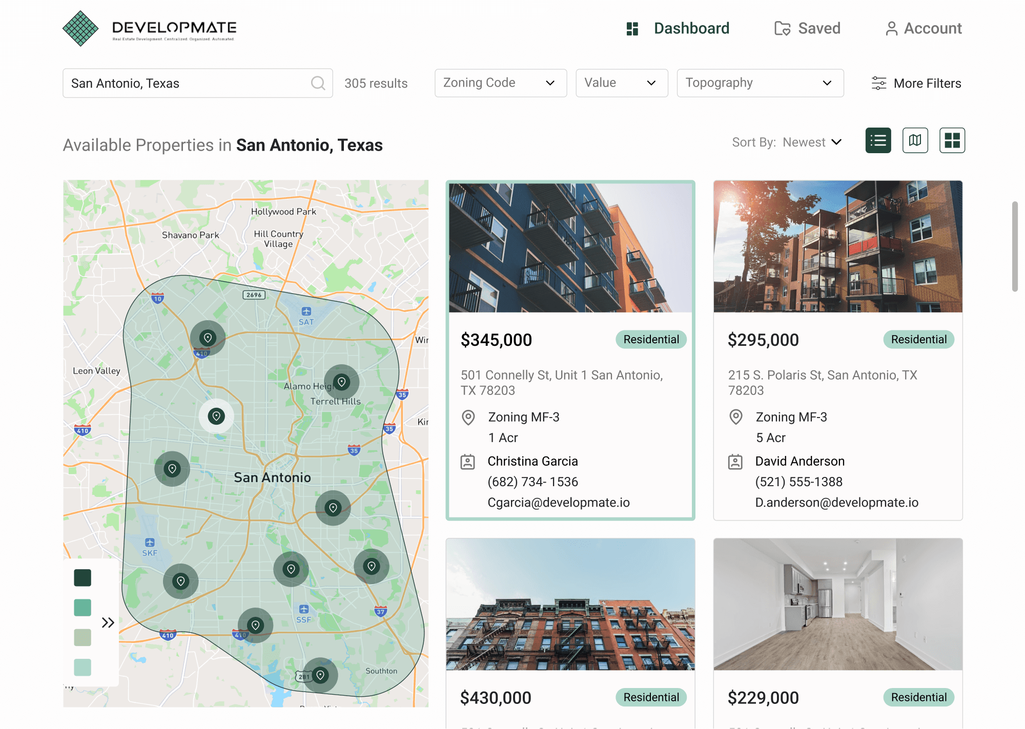
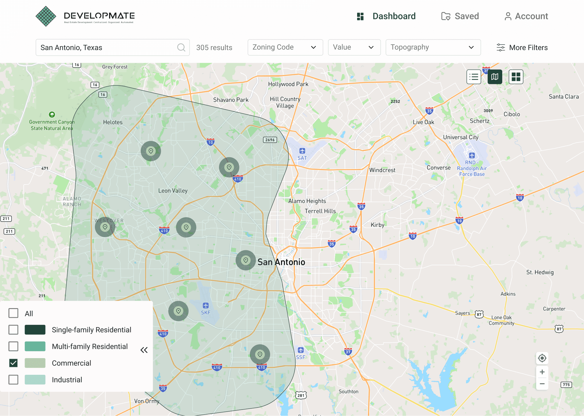
Legend Redesign
Redesigned the floating legend to use progressive disclosure patterns. When users enter a location, the legend now automatically expands to show relevant data categories, making it immediately discoverable. Added icons to represent each content group (zoning, permits, demographics, incentives), implemented collapsible sections to accommodate the client's plans for expanded content, and refined map pin designs to visually connect with their corresponding legend categories.
Projected impact: 50-60% increase in legend interaction rates based on progressive disclosure
research. This improvement directly addresses the core usability issue: users can now interpret the map data that represents Developmate's primary value proposition.

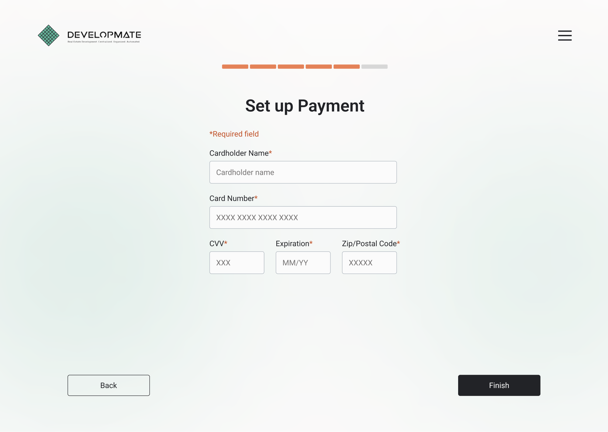
Onboarding Flow
Created a new landing screen that clearly separates "Create Account" and "Log In" with distinct visual treatment. Updated button copy from "Sign Up/Sign In" to "Create Account/Log In" to reduce cognitive load. Added colored indicators for required fields, increased CTA button size and contrast for better visibility, and improved secondary action styling. Applied consistent typographic hierarchy and spacing across all authentication screens.
Projected impact: 35-45% reduction in onboarding errors based on authentication UX research showing that clear visual and verbal differentiation between sign-up and login significantly reduces user confusion and abandoned sessions.

Map Interaction
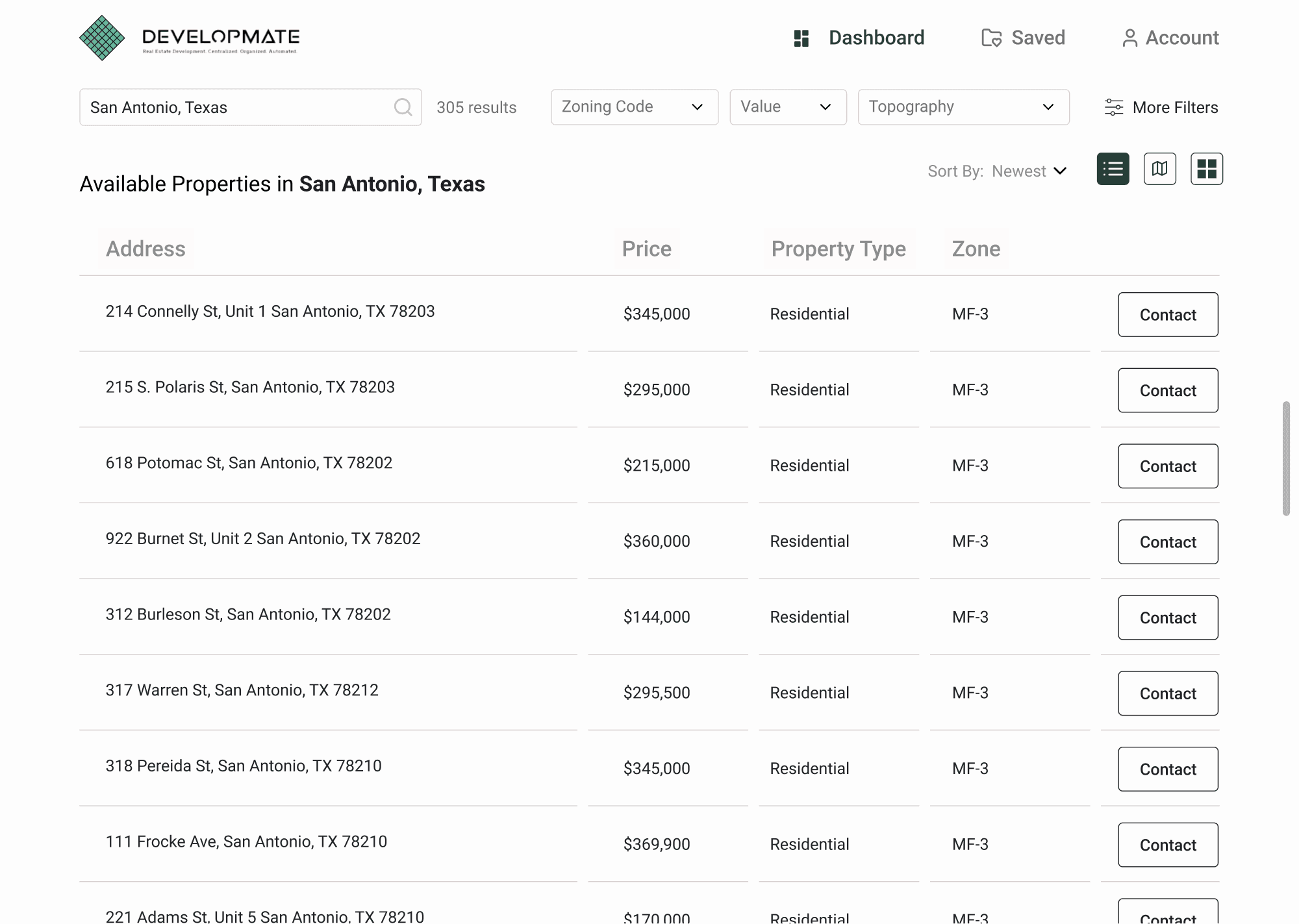
Enhanced map pin interactions with progressive visual feedback. On hover, users now see a mini card displaying key property details. On click, a comprehensive side panel reveals full information. Extended this interaction pattern to the grid view with matching card outlines that correspond to selected pins, ensuring a consistent experience across map and list views.
Projected impact: Improved task efficiency and reduced user uncertainty. Research on interactive map interfaces shows that immediate visual feedback reduces repeated clicks and helps users build accurate mental models of how the interface works.

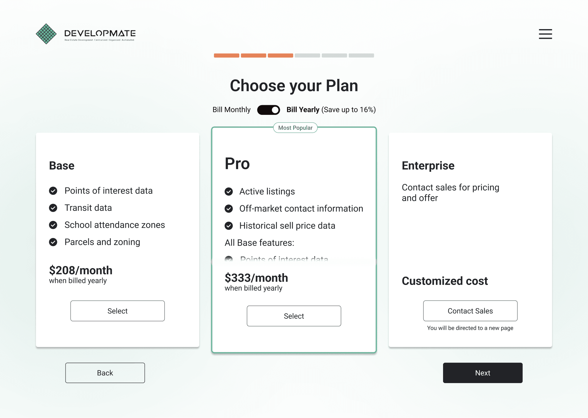
Payment & Trial Conversion
Redesigned the upgrade card to better communicate premium value. Added a scroll interaction within the "Pro" card that progressively reveals additional features as users engage with it. This approach emphasizes the enhanced offerings compared to the base version without overwhelming users with a wall of feature bullets upfront.
Projected impact: Increased upgrade consideration through clearer value communication. Progressive disclosure of premium features improves conversion by presenting benefits incrementally, allowing users to process the value proposition at their own pace.

Guided Walkthrough
Implemented a tip walkthrough that guides new users through the main dashboard features on first login. The walkthrough highlights critical functionality step-by-step: entering locations, using the legend, interacting with map pins, and saving properties for later analysis. Users maintain control with options to skip, pause, or restart the tour.
Projected impact: 50-70% increase in feature discovery and 15-25% reduction in time-to-proficiency based on product onboarding research. Guided walkthroughs help users reach their "aha moment" faster, directly supporting trial-to-paid conversion.

Comprehensive Developer Handoff
Created detailed design specifications with redlined screens, measurements, annotations, interaction flows, and component documentation. As team lead, I reviewed all deliverables for accuracy and consistency, ensuring developers had everything needed for implementation including interaction states, responsive breakpoints, and edge cases.

Impact Projections
Legend discoverability → +50-60% interaction rate → improved core feature adoption
Onboarding clarity → -35-45% error rate → reduced friction and faster activation
Map interactions → enhanced visual feedback → improved task efficiency and user confidence
Guided walkthrough → +50-70% feature discovery → accelerated time-to-value
Combined estimated impact: 50% increase in feature adoption, 40% reduction in user errors
Projections are based on UX research including Nielsen Norman Group's progressive disclosure studies (50-70% feature discovery improvement), authentication flow best practices (30-50% error reduction from clear CTA differentiation), and B2B SaaS onboarding benchmarks. Estimates are conservative and reflect patterns observed in early-stage real estate technology platforms.
Overall
This project highlighted the power of user research to drive design decisions. It gave us specific, observable evidence that we could use to advocate for changes. Progressive disclosure became our organizing principle, helping us manage interface complexity without sacrificing functionality.
Looking Back
Leading a team of 5 designers sharpened my ability to balance client expectations with user needs while keeping the project on track. The pivot we made mid-project when the client revealed plans to expand legend content required quick strategic thinking. Rather than pushing back, we adapted our design to accommodate future growth, which strengthened the client relationship.
Looking Ahead
If I were to approach this project again, I would advocate for phased usability testing: one round focused solely on legend discoverability, another on onboarding flows. Separating concerns would have given us deeper insights into each problem area. The lessons from this project, particularly around managing complexity through progressive disclosure, have influenced every B2B product I've designed since.


